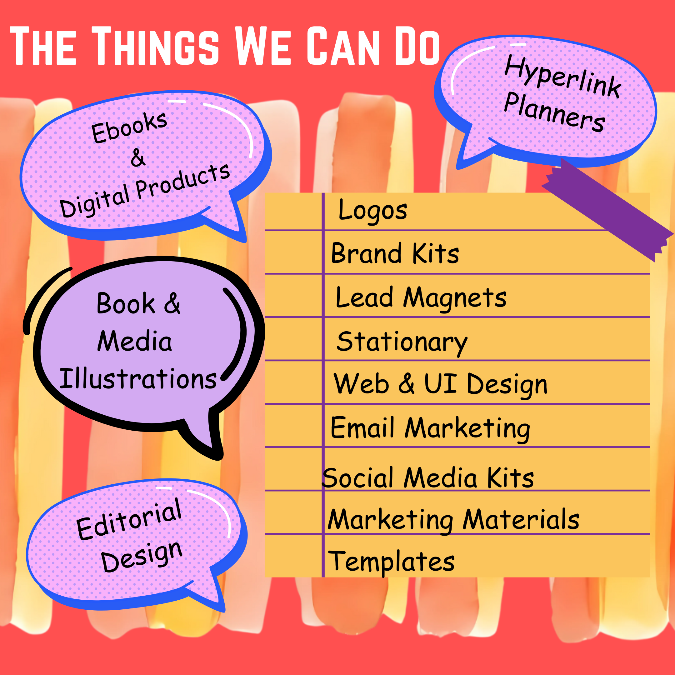
Creative Design for Books, Digital Products, and Growing Brands.
From illustrated books and thoughtfully designed journals to digital products and brand visuals, I create cohesive designs that help ideas stand out and connect with the right audience.

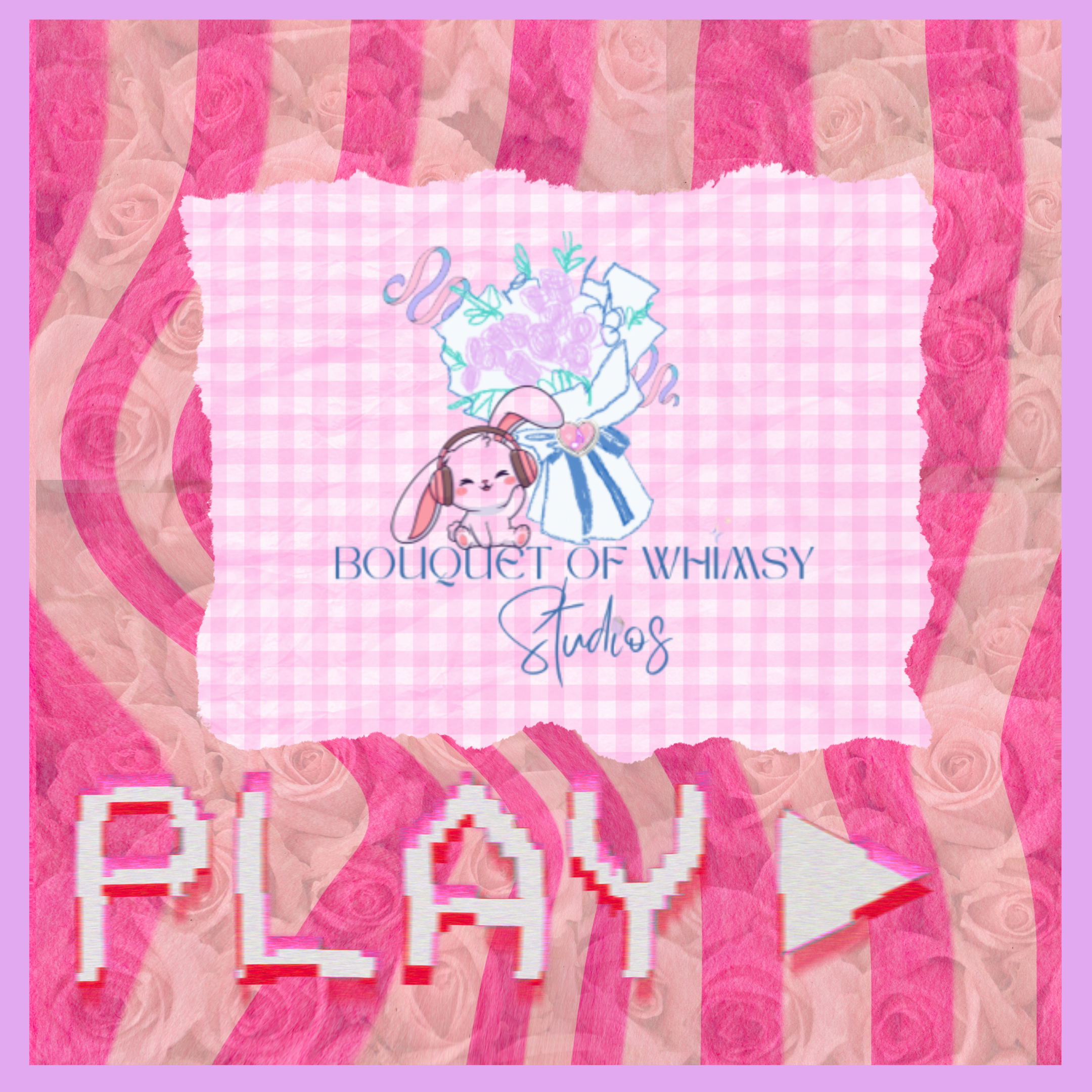
Storybook Aesthetic features a cottage-core, and cozy vibe. With sweet and approachable designs fit for those looking for a romantic and curious style. Fantastical and folklore elements are intertwined to create a cohesive and unique style that whispers fable and story to the soul…
The Vibe: Nostalgic, Narrative, Detailed.
Perfect For: Brands that want to feel like a cherished memory, and those that want to lean into a “once upon a time” magic.
Best Usage: Children’s Books, Stationary or immersive personal branding.
The Style Menu
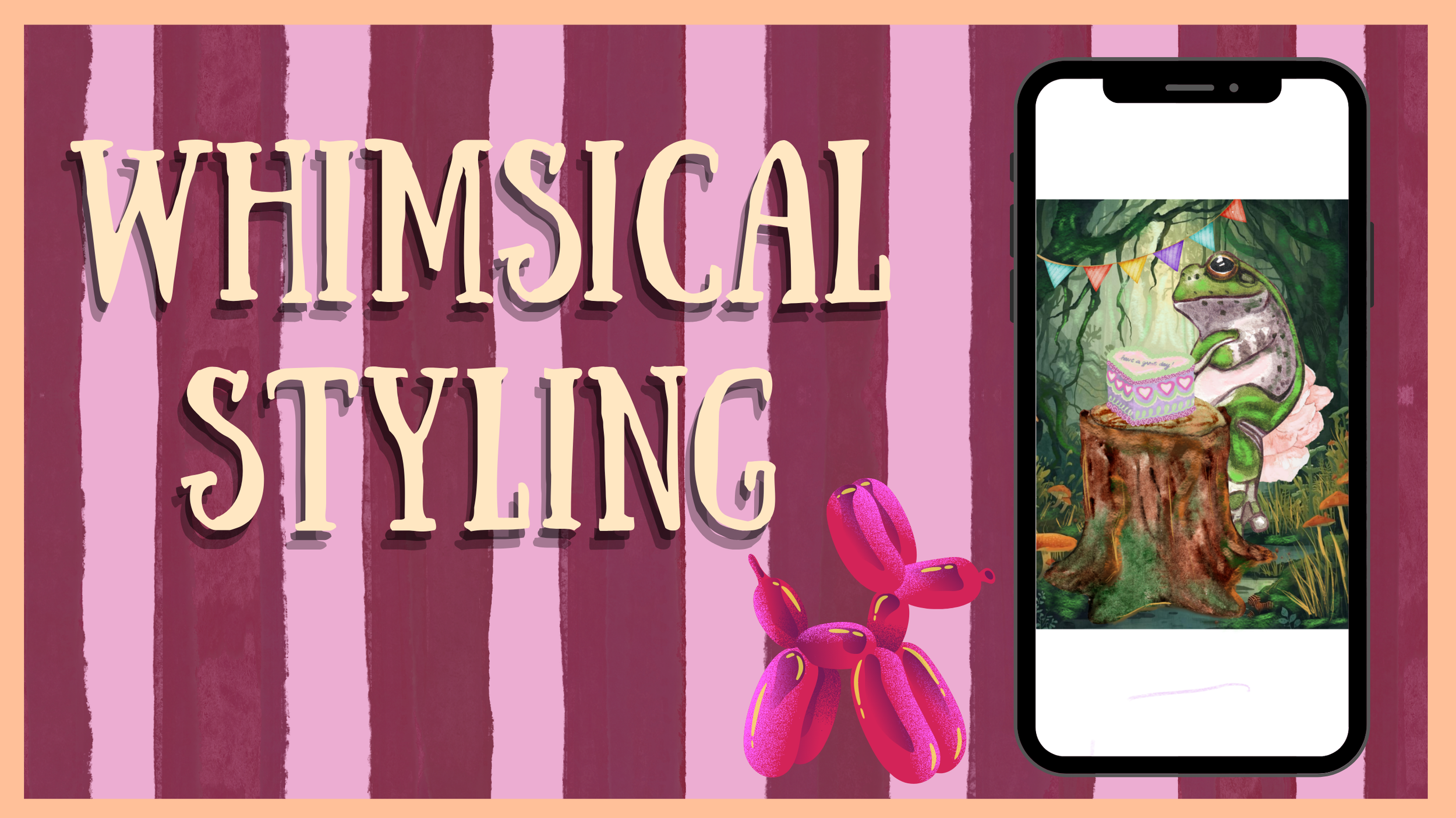
Whimsical Styling: features charm, delight and above all daydreams. With imaginative and playfully fluid designs, this style is all about escapism and wonder. Fairytales, and forests, teacups and cakes had by toads- dance vividly with familiar tones and palettes to create unexpected flourishes that bring smiles, and stir the imagination.
The Vibe: Playful, Imaginative, Curious
Perfect For: Brands looking to evoke imagination, lightheartedness, gentle mystery and the “curious, and curiouser” magic.
Best Usage: Event planning/ branding, boutique packaging, creative portfolios that feature journals, books, and decor.
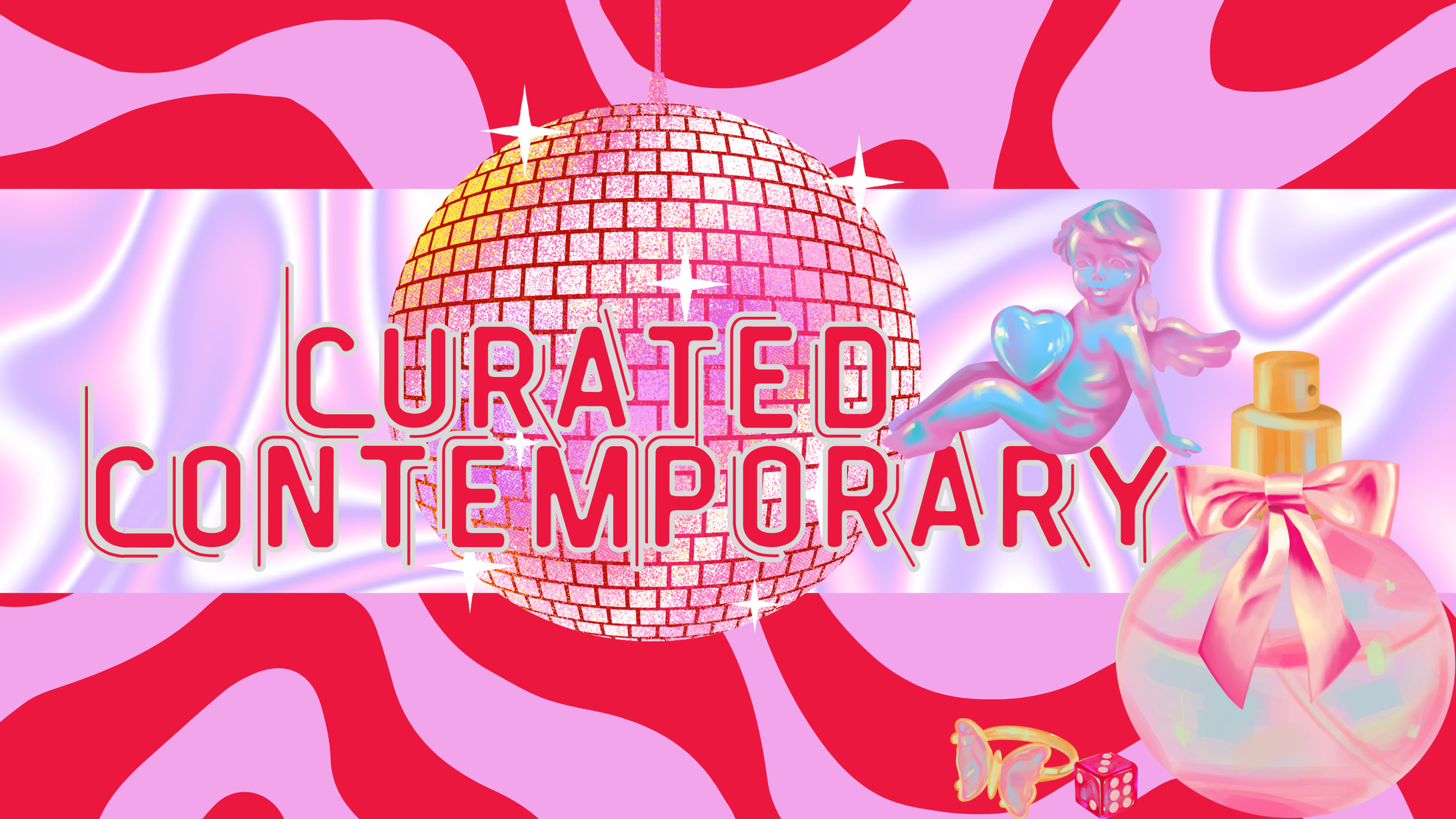
Curated Contemporary: The perfect fusion of editorial meets trending. With dynamic energy, just enough movement, and the latest in trending, and fashionable hype, this style will get you noticed, and keep you algorithm worthy. With multi-generational appeal this concept can be curated to work across multiple boards with the end result always being the same. Hype. Focus. Relevance.
The Vibe: Edgy, Vanguard, Kinetic
Perfect For: Brands that want to lead, and dominate the headlines. Culture shifters, modern founders, and those who don’t follow the hype- they create it.
Best Usage: Visual hype, socials, marketing kits, packaging, and brand pitching.
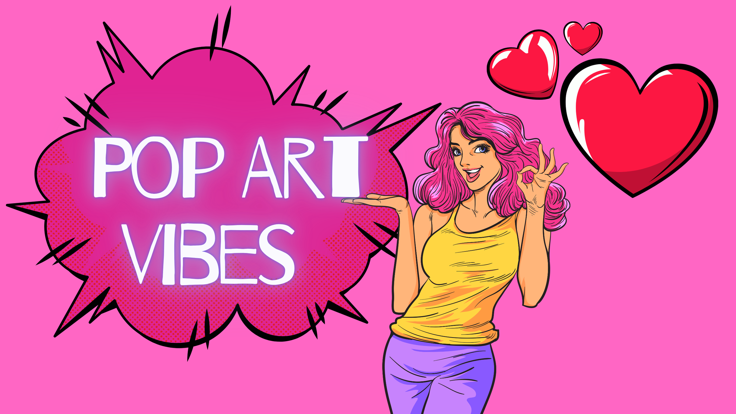
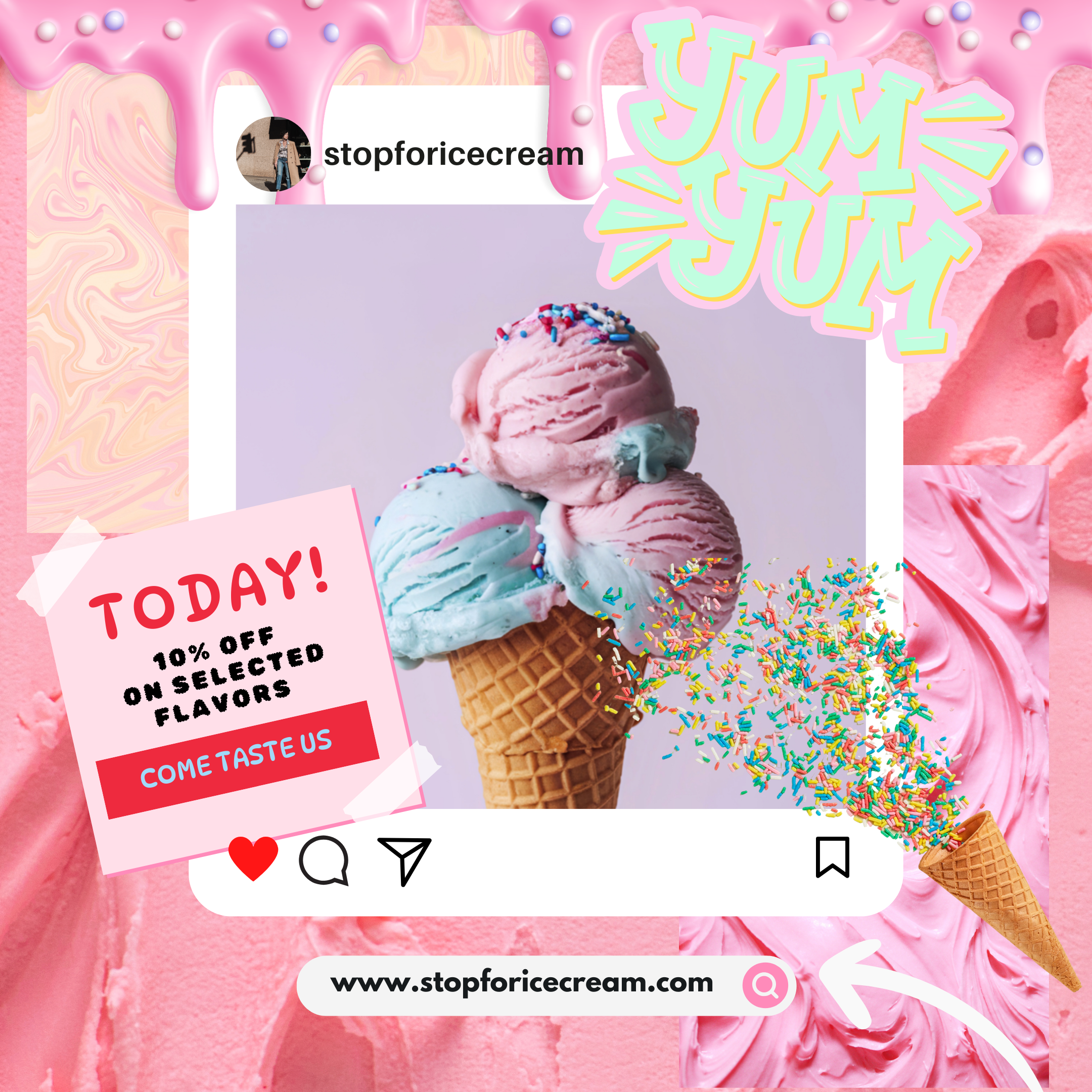
Pop Art Vibes features bold, high-energy and iconic focused styling that creates feelings of excitement. With colorful and flirtatious design this is a perfect match for those looking to create transparent enthusiasm. Neon’s, “bubble-gums”, and candy shoppe palettes harmoniously collide to create a platonic “come- hither”, and illicit a door opening, and welcoming vibrancy.
The Vibe: Bold, High Energy, Iconic.
Perfect For: Brands that want to feel cool, trending, and vibrant. For those that want to embrace the “kid in a candy shop” magic.
Best Usage: Social Media Campaigns, Fashion Labels, Consumer Packaged Goods.
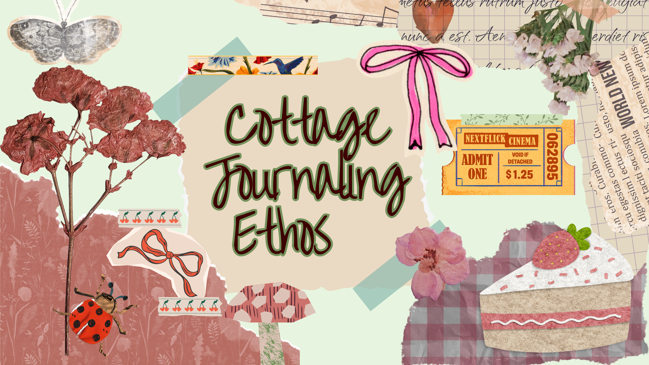
Cottage Journaling Ethos: features, romantic and human inspired elements that when woven together create an inspiring and soft medium. With natural, textured, and soft colored palettes this style flexes easily between moody and romantic, this style is all about lived in and cozy.
The Vibe: Cozy, Authentic, Romantic
Perfect For: Lifestyle Influencers, Cottage-core enthusiast Hobbyists, Creatives and Brands looking to evoke community and the “human-touch” magic.
Best Usage: “low content”, stationary, hobbyist, and hyper-feminine products, website banners, and wallpapers.
Our Process
Stage One:
Intake: All of our prospective clients are asked to please fill out an intake form upon request for a quote or services. The intake form will give us an idea on how to best service your account. Reviewing the website, and being familiar with our styles, and process will help you create the best results, and the most timely turn around. We unfortunately cannot answer any significant design questions until the intake form is filled out, and reviewed. This generally takes no more than 24-48 hours.
Stage Two:
Onboarding: Once we review your intake form, we will decide if you are a good studio fit. We work with companies, brands, and persons, that are aesthetically aligned with our brand and studio to create a smooth and professional experience for everyone. While we are flexible in our design, and style process, we appreciate working with clients that reflect our core artistry. If you are accepted as a client, you will receive a proposal, with estimated service prices, and a timeline for delivery. You will be required to please sign and date the “agreement.” Please make note of the payment installations.
Stage Three:
Drafting & Mock Ups: Once your package has been decided, you will be required to submit a 50% deposit of the total estimated cost, before your project begins. Once we have received your deposit, you will receive a “Bouquet” which is the term we use for providing you with your requested products proofs. Revision terms are outlined in each contract, and we usually send a 2-3 design option packet depending on the type of project.
Once your mock ups, and “Bouquet” have been approved, and accepted by you, another 25% payment will be due before final delivery. Upon installment receipt, we will begin converting files for you. Upon delivery you will receive all agreed upon products, and all agreed upon variations. Examples: pdf, jpeg, png, gif, epub etc. Final Payment is due immediately upon delivery.
Delivery: